The Video Player Block shows a YouTube, Vimeo, or self-hosted video. The video can play on the page, sit behind an image with a play icon, or open in a popup over the page.
Use it for product demos, course lessons, testimonials, and hero sections with a “Watch the video” button.
How to Add a Video Player Block
Follow these steps to add and configure the Video Player Block in the Gutenberg editor.
Step 1: Add the Video Player Block
- Open a page or post in the WordPress Gutenberg editor.
- Click the + button to open the block inserter.
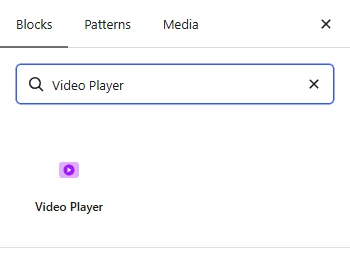
- Search for Video Player under ShapeBlock.
- Insert the Video Player Block into your page.
- Select the block to access its settings in the right-hand sidebar.
- Choose the video type and enter the video URL, or choose a video file.
Step 2: Configure the Video Player Block
Select the Video Player Block and open its settings in the right-hand sidebar. The available tabs are:
- Settings: Choose the video, how it is shown, and the playback options.
- Style: Customize the overlay, play icon, and popup.
- Advanced: Configure the block padding, margin, and background.
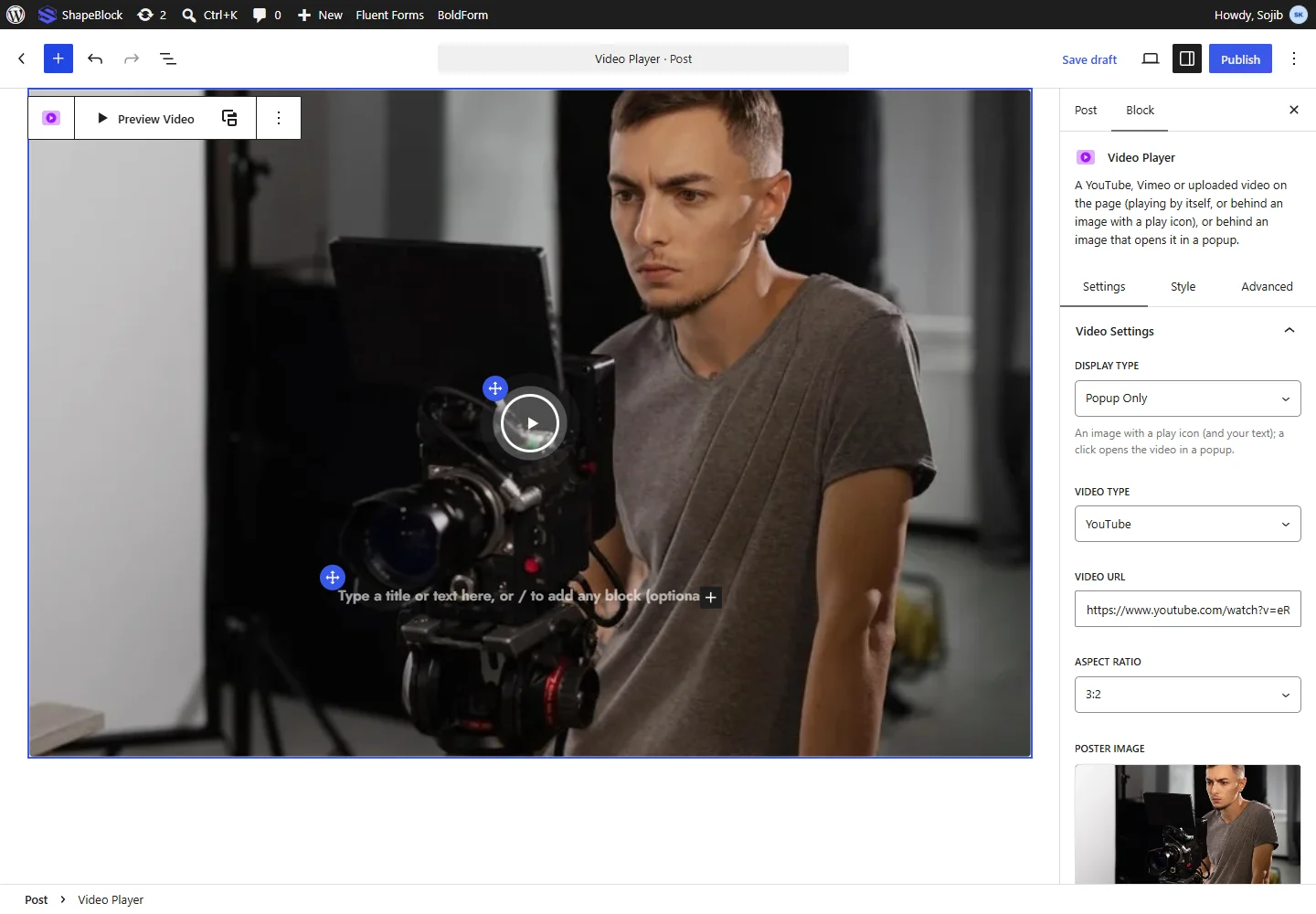
Click Preview Video in the block toolbar to watch the video in the editor.
With an image overlay, click the image twice to type a title or text on it, or add any block with /. Drag the blue handle of the play icon or of the text to move it.
Settings Tab
The Settings tab contains the Video Settings, Video Options, and Video Overlay panels.
1. Video Settings
- Display Type: Choose Normal Only to show the video on the page, or Popup Only to show an image with a play icon that opens the video in a popup.
- Video Type: Choose YouTube, Vimeo, or Self Hosted.
- Video URL: Paste the YouTube or Vimeo link.
- Self Hosted Video: Choose an MP4 or WebM file from the Media Library or your computer.
- Aspect Ratio: Choose 16:9, 21:9, 4:3, 3:2, 1:1, 9:16, or Custom height. With Custom height, set the Video Height (px).
- Poster Image: Choose the image shown before the video plays. For YouTube, the video thumbnail is used when empty.
- Video Max Width: Limit the video width, for example 800px or 80%. Responsive settings are available.
- Video Border Radius: Round the video corners.
2. Video Options
The options shown depend on the video type.
- Autoplay: Play the video by itself. Browsers only allow this without sound. Not available with Popup Only.
- Mute: Start the video without sound.
- Loop: Play the video again when it ends.
- Player Controls: Show the play, pause, and volume buttons on the video.
- Full Screen Button: Let visitors watch on the whole screen. YouTube and self-hosted videos.
- Captions: YouTube only. Show subtitles from the start, when the video has them.
- Download Button: Self-hosted only. Let visitors save the video file.
- Picture-in-Picture Button: Self-hosted only. Let the video keep playing in a small window while visitors scroll.
- Controls Color: Vimeo only. Set the color of the player controls.
- Suggested Videos: YouTube only. Show videos From the same channel or Any video when the video ends.
- Intro Title, Intro Portrait, Intro Byline: Vimeo only. Show or hide the video title, the author picture, and the author name.
- Start Time (seconds) and End Time (seconds): Play only part of the video. End Time is not available for Vimeo.
3. Video Overlay
- Image Overlay: Show an image with a play icon over the video until it is clicked. When off, the player itself is shown.
- Play Icon: Show the play icon. When off, a click anywhere on the image plays the video.
- Active Ripple: Show waves around the play icon.
- Lightbox: Open the video in a popup over the page instead of playing it in place of the image.
- Play Icon Position and Text Position: Set the place of the play icon and the text with Left (%) and Top (%). You can set a different place on tablet and mobile.

Style Tab
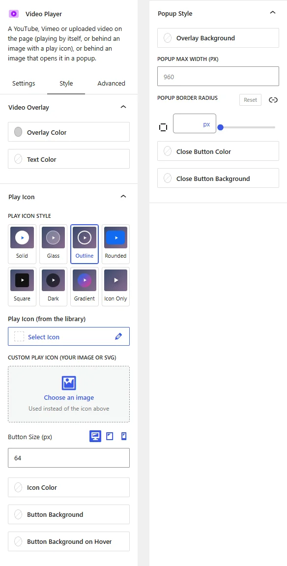
The Style tab contains the Video Overlay, Play Icon, and Popup Style panels.
1. Video Overlay
- Overlay Color: Set a color or gradient over the image, so the play icon and text stand out.
- Text Color: Set the color of the text on the image.
2. Play Icon
- Play Icon Style: Click a look for the play button: Solid, Glass, Outline, Rounded, Square, Dark, Gradient, or Icon Only.
- Play Icon (from the library): Choose a different play icon.
- Custom Play Icon (your image or SVG): Use your own image instead of the icon above.
- Button Size (px): Set the play button size. Responsive settings are available.
- Icon Color: Set the play icon color.
- Button Background and Button Background on Hover: Set the play button background, and its background when pointed at.
3. Popup Style
This panel appears when the video opens in a popup.
- Popup Max Width (px): Set the largest width of the popup video.
- Overlay Background: Set the color behind the popup.
- Popup Border Radius: Round the popup corners.
- Close Button Color and Close Button Background: Set the colors of the close button.
Advanced Tab
The Advanced tab provides additional spacing and background controls for the Video Player Block. These settings apply to the entire block.
1. Spacing
- Padding: Set the inner spacing around the entire Video Player Block. Configure the top, right, bottom, and left values separately.
- Margin: Set the outer spacing around the entire Video Player Block. Configure the top, right, bottom, and left values separately.
Both controls support responsive settings for desktop, tablet, and mobile devices.
2. Background
- Background: Customize the background of the entire Video Player Block using a background color or gradient.
Note: The background applies to the whole block area.
Live demo: see the Video Player Block in action on the Video Player demo page.