The Post Carousel Block shows posts as cards in a sliding carousel. Each card can show the featured image, category, date, author, title, excerpt, and a read more link.
Use it for a “Latest from the blog” section, related posts under an article, or a hand-picked set of posts.
How to Add a Post Carousel Block
Follow these steps to add and configure the Post Carousel Block in the Gutenberg editor.
Step 1: Add the Post Carousel Block
- Open a page or post in the WordPress Gutenberg editor.
- Click the + button to open the block inserter.
- Search for Post Carousel under ShapeBlock.
- Insert the Post Carousel Block into your page.
- Select the block to access its settings in the right-hand sidebar.

Step 2: Configure the Post Carousel Block
Select the Post Carousel Block and open its settings in the right-hand sidebar. The available tabs are:
- Settings: Choose which posts to show, what each card shows, and how the carousel moves.
- Layout: Set the image size and height, and the content alignment.
- Style: Customize the cards, image, category, title, date, excerpt, read more link, and arrows.
- Advanced: Configure the block padding, margin, and background.
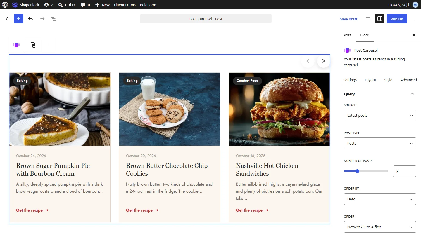
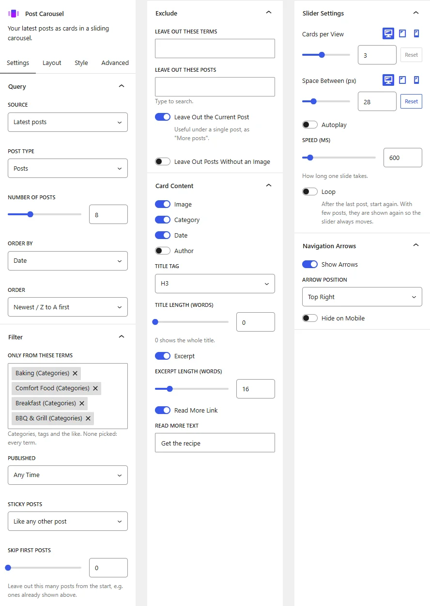
Settings Tab
The Settings tab contains the Query, Filter, Exclude, Card Content, Slider Settings, and Navigation Arrows panels.
1. Query
- Source: Choose Latest posts, Pick posts by hand, or Related to the post being viewed.
- Post Type: Choose the type of content to show, such as Posts or Pages.
- Posts to Show: When picking by hand, type to search and choose the posts. They show in the order picked.
- Number of Posts: Set how many posts are loaded.
- Order By: Sort by Date, Last Modified, Title, Most Comments, Menu Order, Author, or Random.
- Order: Choose Newest / Z to A first or Oldest / A to Z first.
2. Filter
- Only From These Terms: Show only posts from the chosen categories, tags, or other terms. None picked shows every term.
- Only By These Authors: Show only posts by the chosen authors.
- Published: Limit posts to Any Time, Past Day, Past Week, Past Month, Past 3 Months, or Past Year.
- Sticky Posts: Treat sticky posts Like any other post, Show them first, Show only sticky posts, or Leave them out.
- Skip First Posts: Leave out this many posts from the start, for example ones already shown above.
3. Exclude
- Leave Out These Terms: Hide posts from the chosen terms.
- Leave Out These Authors: Hide posts by the chosen authors.
- Leave Out These Posts: Type to search and choose posts to hide.
- Leave Out the Current Post: Hide the post being viewed. Useful under a single post, as “More posts”.
- Leave Out Posts Without an Image: Show only posts that have a featured image.
4. Card Content
- Image, Category, Date, Author: Turn each part of the card on or off.
- Title Tag: Choose the HTML tag for the post titles: H2 to H6 or P.
- Title Length (words): Shorten long titles to this many words. 0 shows the whole title.
- Excerpt: Show a short excerpt. Set the Excerpt Length (words).
- Read More Link: Show a link to the post. Set the Read More Text.
5. Slider Settings
- Cards per View: Set how many cards are visible at once. Responsive settings are available.
- Space Between (px): Set the space between cards. Responsive settings are available.
- Autoplay: Move to the next card by itself. Set the Autoplay Delay (ms) and turn on Pause on Hover if needed.
- Speed (ms): Set how long one slide takes.
- Loop: Start again after the last post. With few posts, they are shown again so the slider always moves.
6. Navigation Arrows
- Show Arrows: Show previous and next arrows.
- Arrow Position: Place the arrows at the Sides, Top Left, Top Right, Bottom Left, Bottom Center, or Bottom Right.
- Hide on Mobile: Hide the arrows on phones.
Layout Tab
The Layout tab contains the Layout panel.
1. Layout
- Image Size: Choose the image file size that is loaded. This option appears when the image is shown.
- Image Height (px): Set the height of the card image. Responsive settings are available.
- Content Alignment: Align the card text Left, Center, or Right.
Style Tab
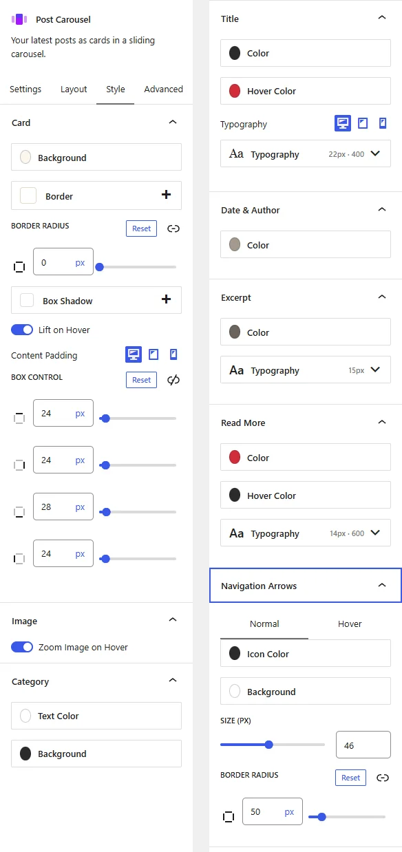
The Style tab contains a panel for each part of the card. A panel only appears when its part is turned on.
1. Card
- Background: Set the card background color or gradient.
- Border: Set the card border.
- Border Radius: Round the card corners.
- Box Shadow: Add a shadow around the card.
- Lift on Hover: Raise the card slightly when a visitor points at it.
- Content Padding: Set the space around the card text. Responsive settings are available.
2. Image
- Zoom Image on Hover: Zoom the image slightly when a visitor points at the card.
3. Category
- Text Color and Background: Set the colors of the category label.
4. Title
- Color and Hover Color: Set the title color and its color when pointed at.
- Typography: Customize the font family, size, weight, style, text transform, line height, and letter spacing. Responsive settings are available.
5. Date & Author
- Color: Set the color of the date and author line.
6. Excerpt
- Color: Set the excerpt color.
- Typography: Customize the font family, size, weight, style, text transform, line height, and letter spacing.
7. Read More
- Color and Hover Color: Set the link color and its color when pointed at.
- Typography: Customize the font family, size, weight, style, text transform, line height, and letter spacing.
8. Navigation Arrows
- Icon Color and Background: Set the arrow colors for the Normal and Hover states.
- Size (px): Set the arrow size.
- Border Radius: Round the arrow corners.
Advanced Tab
The Advanced tab provides additional spacing and background controls for the Post Carousel Block. These settings apply to the entire block.
1. Spacing
- Padding: Set the inner spacing around the entire Post Carousel Block. Configure the top, right, bottom, and left values separately.
- Margin: Set the outer spacing around the entire Post Carousel Block. Configure the top, right, bottom, and left values separately.
Both controls support responsive settings for desktop, tablet, and mobile devices.
2. Background
- Background: Customize the background of the entire Post Carousel Block using a background color or gradient.
Note: The background applies to the whole block area.
Live demo: see the Post Carousel Block in action on the Post Carousel demo page.