The Comparison Table Block puts plans or products side by side in a real table. Each column is a plan or a product with its name, price and button; each row is a feature with a tick, a cross, a dash or a short text in every column. One column can be highlighted as the one you recommend.
Use it for pricing plans, product comparisons, service tiers, “us versus them” tables, sizes and specifications, or opening hours. On phones it shows one column at a time with a switch above it, or scrolls sideways with the labels held in place.
How to Add a Comparison Table Block
Step 1: Add the Comparison Table Block
- Open a page or post in the WordPress Gutenberg editor.
- Click the + button to open the block inserter.
- Search for Comparison Table under ShapeBlock Pro.
- Insert the block. It starts with three plans and five rows to edit.
- Type the names, subtitles, prices, button text and row labels right on the table.
- Click a tick, cross or dash on the table to change it to the next one.

Step 2: Configure the Comparison Table Block
Select the block and open its settings in the right-hand sidebar. The tabs are:
- Settings: The columns, the rows and what the table shows.
- Layout: Column widths, spacing, the sticky head and the phone view.
- Style: Colours, typography, borders and buttons.
- Advanced: Spacing and background of the whole block, plus the shared ShapeBlock Pro options.
Settings Tab
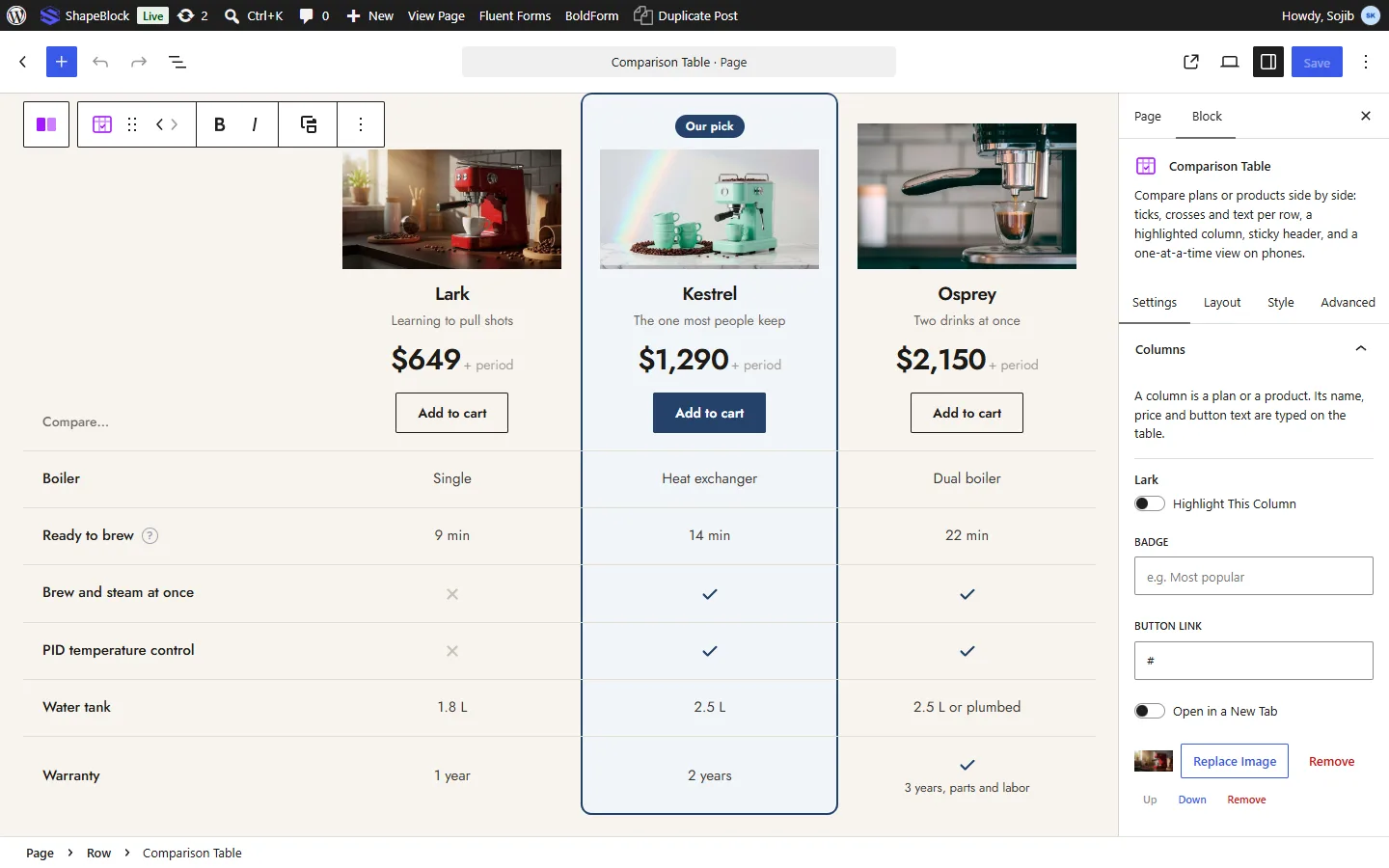
1. Columns
- Highlight This Column: Frames the column in the accent colour and gives it its own background. On phones the table opens on this column.
- Badge: A small label above the name, for example Most popular.
- Button Link: The address of the column’s button, with Open in a New Tab.
- Image: A product photo or logo at the top of the column (when Show Images is on).
- Up, Down, Remove, Add Column: Order the columns, take one out, or add one (up to six). The values in every row move with their column.
2. Rows
- Group Heading: Turns the row into a heading that starts a group of rows, such as Delivery or Support.
- Tooltip: A short explanation shown next to the label when a visitor points at the question mark or taps it.
- Value per column: Tick, Cross, Dash or Text. For a tick or a cross you can add a short note shown under it, for example Twice a year.
- Up, Down, Remove, Add Row, Add Group Heading: Order and add rows.
3. Table
- Show Images: A photo or logo at the top of each column.
- Show Prices: The price and the period (for example /month) under each name.
- Buttons: At the Top, At the Bottom, Top and Bottom, or None.
- Striped Rows: Shades every other row.
- Shade the Row Pointed At: Shades the row under the pointer, to follow it across.
- Tick Means and Cross Means: What screen readers read out for a tick and a cross. Defaults: Included and Not included.
Layout Tab

- Label Column Width: The width of the first column. Empty: 30%, and 50% on phones. Responsive settings are available.
- Smallest Column Width: How narrow a column may get when the table scrolls sideways. Empty: 150px.
- Space Inside Cells: The padding of every cell. Responsive settings are available.
- Values Line Up: Center or Left.
- Keep the Head in View: The column names stay at the top of the screen while a long table scrolls by. Space Above leaves room for a fixed site header.
- On Phones: One Column at a Time, With a Switch shows one plan with a switch above the table to pick another. Scroll Sideways, Labels Held keeps every column and lets the table scroll, with the labels staying in place.
Style Tab

- Table: Accent colour (ticks, the highlight frame and the badge use it), the highlighted column’s background, the table background, the lines between rows, an outer border, rounded corners and a shadow.
- Column Heads: Background, name colour and typography, subtitle colour, price colour and typography, badge colours.
- Rows: Label and value colours and typography, tick colour, cross and dash colour, tick size, group heading colours, stripe and hover colours.
- Buttons: Colours at rest and on hover, separate colours for the highlighted column, border, corner radius, padding and typography.
- Phone Switch: The colours of the switch shown above the table on phones.
Advanced Tab
The Advanced tab provides spacing, background and position controls for the whole block, plus the ShapeBlock Pro extensions (Responsive, Display Conditions and Motion Effects).
Tips
- Keep labels short and put the detail in a tooltip.
- Highlight only one column. Two highlighted columns cancel each other out.
- For long tables, turn on Keep the Head in View so visitors always know which column is which.
- Use Scroll Sideways on phones for specification tables where every column matters; use the switch for plans, where people pick one.
Live demo: see the Comparison Table Block in action on the Comparison Table demo page.