The Rating Block shows a score the way review sites do: a row of stars filled to the exact rating, so 4.3 fills four stars and a third of the fifth, with the score, a title and a short line such as the number of reviews. It can also show a breakdown in bars, for example how many reviews gave five stars, four stars and so on.
Use it for a review summary, a trust line in a hero section, the rating on a product, room or plan card, the stars at the top of a testimonial, scores from other review sites, or any score out of 5 or out of 10. The stars can also be hearts, dots or an icon of your choice.
How to Add a Rating Block
Follow these steps to add and set up the Rating Block in the Gutenberg editor.
Step 1: Add the Rating Block
- Open a page or post in the WordPress Gutenberg editor.
- Click the + button to open the block inserter.
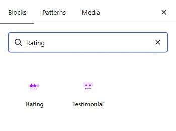
- Search for Rating under ShapeBlock Pro.
- Insert the block into your page. It starts with a 4.8 rating, the title Excellent and a sample caption.
- Select the block and change the rating, the title and the caption in the sidebar.
Step 2: Configure the Rating Block
Select the Rating Block and open its settings in the right-hand sidebar. The available tabs are:
- Settings: Set the rating, the scale, the rounding and the shape, the layout and the texts, and the breakdown bars.
- Layout: Set the alignment, the size of the stars, the space between them and between the bars, and the padding.
- Style: Style the stars, the box around the block, the score, the title, the caption and the bars.
- Advanced: Set the spacing, position and background of the whole block.

Settings Tab
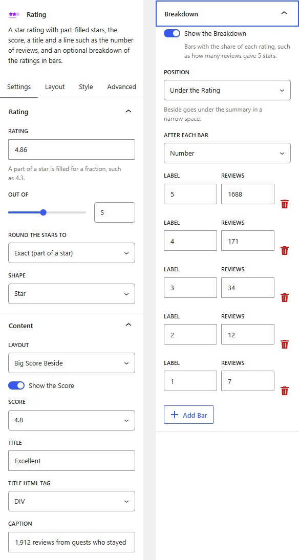
The Settings tab contains the Rating, Content and Breakdown panels.
1. Rating
- Rating: The score, for example 4.8. Decimals are allowed: the last star is filled by the fraction, so 4.3 fills a third of the fifth star. It cannot be higher than the Out Of value.
- Out Of: How many stars there are, from 1 to 10. Use 5 for a usual star rating and 10 for a score out of ten.
- Round the Stars To: Exact (part of a star) fills the stars to the exact rating. Half Stars rounds the rating to the nearest half, so 4.7 shows 4.5. Whole Stars rounds it to a whole number, so 4.7 shows 5. The score text is rounded in the same way.
- Shape: Star, Heart, Dot or Icon. With Icon, an Icon picker appears: choose any icon from the icon library, such as a cup or a thumbs up. Filled icons work best, because the fill is cut to the rating in the same way as a star.
2. Content
- Layout: Stars Only shows the stars with a small score after them, a good fit for cards and testimonials. Big Score Beside puts a large score to the left of the title, the stars and the caption. Big Score Above puts the large score on top and centers everything under it.
- Show the Score: Turn the score on or off. Turn it off to show the stars alone, for example at the top of a testimonial.
- Score: Show the score as 4.8, or with the scale as 4.8/5.
- Title: A short line above the stars, for example Excellent or Guest rating. Leave it empty to hide it.
- Title HTML Tag: The HTML tag for the title: H2 to H6, P or DIV. The default is DIV. This option appears when there is a title.
- Caption: A line under the stars, for example Based on 1,284 reviews. Leave it empty to hide it.
3. Breakdown
- Show the Breakdown: Turn on bars that show the share of each rating, such as how many reviews gave 5 stars.
- Position: Under the Rating puts the bars below the score. Beside the Rating puts them to the right of the score while there is room, and moves them under it in a narrow space such as a phone.
- After Each Bar: Show the Percent of all reviews, the Number of reviews, or Nothing.
- Label and Reviews: Each bar has a label, such as 5 or 5 stars, and the number of reviews for it. The bar lengths are worked out from these numbers. The trash icon removes a bar, and Add Bar adds one.
Layout Tab

- Alignment: Align the rating to the left, center or right. Responsive settings are available, so a rating can sit on the right on a desktop and on the left on a phone.
- Star Size: The size of the stars, hearts, dots or icons, for example 16px. When empty, 20px. Responsive settings are available.
- Space Between Stars: The gap between the stars. When empty, 3px. Responsive settings are available.
- Space Between Bars: The gap between the breakdown bars. When empty, 10px. This option appears when the breakdown is on. Responsive settings are available.
- Padding: The space inside the block, between the box border and the content. Responsive settings are available.
Style Tab
The Style tab contains the Stars, Box, Score, Title, Caption and Breakdown panels.

1. Stars
- Filled Color: The color of the filled part of the stars. When empty, a warm yellow.
- Empty Color: The color of the empty stars and of the unfilled part of a star.
2. Box
- Background: A color or gradient behind the whole rating, to turn it into a card or a badge.
- Border: The style, width and color of the outline.
- Border Radius: Round the corners of the box.
- Box Shadow: A shadow under the box.
3. Score
- Color and Typography: The color and font of the score. This panel appears when the score is shown. Responsive settings are available for desktop, tablet and mobile.
4. Title and 5. Caption
- Color and Typography: The color and font of the title, and of the caption. Responsive settings are available.
6. Breakdown
- Bar Color: The color of the filled bars. When empty, the Filled Color of the stars.
- Track Color: The color of the bar background.
- Text Color: The color of the labels and of the numbers after the bars.
- Bar Height: The thickness of the bars. When empty, 8px.
- Bar Radius: Round the ends of the bars. When empty, fully round. Use 0 for square ends.
This panel appears when the breakdown is on.
Advanced Tab
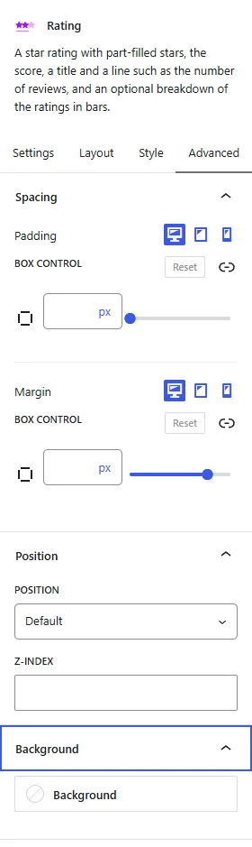
The Advanced tab has the same panels as on every ShapeBlock block: Spacing (padding and margin per device), Position (place the rating with Absolute or Fixed, with offsets, width and z-index), and Background (a color or gradient behind the whole block). They are explained in Advanced Tab: Spacing, Position and Background.
Tips
- For a trust line in a hero section, use Stars Only with the score shown and a caption such as the number of reviews.
- For testimonial cards, use Stars Only, turn the score off and leave the title and the caption empty.
- For a review summary, use Big Score Beside with the breakdown beside it and the numbers after the bars, and give the box a white background, a thin border and a soft shadow.
- For a score out of ten, set Out Of to 10, choose the Dot shape with a small Star Size, and show the score as 9.6/10.
- Use the same Filled Color for the stars across a page, so every rating reads as part of one design.
Live demo: see the Rating Block in action on the Rating demo page.