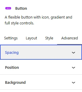
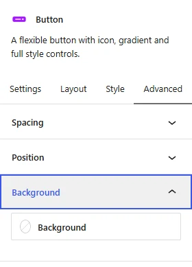
Every ShapeBlock block, free and Pro, has an Advanced tab as the last tab in its sidebar. It holds the same three panels everywhere: Spacing, Position, and Background. Once you know them on one block, you know them on all of them.
The Menu and Mega Menu blocks are the exception: they do not have this tab.
How to Open the Advanced Tab
- Select a ShapeBlock block in the editor.
- In the right-hand sidebar, click Advanced.
- Click a panel title to open it.
With ShapeBlock Pro, more panels can follow these three, such as Display Conditions and Motion Effects. They have their own docs.
Spacing
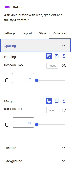
- Padding: The space inside the block, between its edge and its content. Set top, right, bottom, and left together, or click the link icon to set each side.
- Margin: The space outside the block, between it and the blocks around it.
Both have device icons: desktop, tablet, and phone. The tablet value applies at 1024px wide and below, the phone value at 767px and below. Leave a device empty to keep the value of the larger screen.
Note: The Row and Column also have Padding and Margin in their Style tab. If you set both, the Advanced tab value is the one used.
Position
Position takes a block out of the normal flow of the page and places it where you want: over an image, in a corner of a Column, or fixed on the screen.
Position
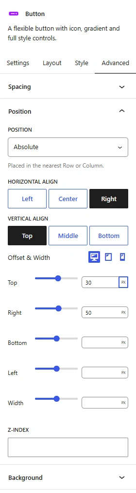
- Default: The block sits in the page like any other block. The other Position options are hidden.
- Absolute: The block is placed inside the Column that holds it. The blocks around it close up the space it leaves.
- Fixed: The block is placed in the browser window and stays there while the visitor scrolls, for example a “Chat with us” button in the bottom corner.
Horizontal Align and Vertical Align
With Absolute or Fixed, two rows of buttons appear. They pick the edge the block sticks to:
- Horizontal Align: Left or Right puts the block against that edge. Center centers it from left to right.
- Vertical Align: Top or Bottom puts the block against that edge. Middle centers it from top to bottom.
The chosen button is filled in. Click it again to clear it. With no alignment chosen, the block stays where it would have been, only lifted out of the flow.
Offset & Width
This group has one set of device icons for all its lines, so you can give desktop, tablet, and phone their own values. Each line has a slider and a number field with a unit: px, %, vw, or vh.
- Top, Right, Bottom, Left: Move the block away from that edge. Negative values are allowed and push the block past the edge, for example a badge that hangs over the corner of a card.
- Width: Set the width of the block. Leave it empty to keep its natural width.
An empty field leaves that side unset. Horizontal and Vertical Align are the same on every device; only the offsets and width change per device.
Z-Index
Set which block is in front when blocks overlap. A higher number sits on top. The Row has no Z-Index here: it keeps its own in Layout > Position & Z-Index, next to its Sticky setting.
Example: a Button in the Top-Right Corner of a Column
- Select the Button inside the Column.
- In Advanced > Position, set Position to Absolute.
- Click Right under Horizontal Align and Top under Vertical Align.
- Type 50 in the Right field and 30 in the Top field, with the unit px.
The button now sits 50px in from the right edge of the Column and 30px down from its top. The Column padding does not count: the offsets are measured from the Column edge itself. Without an offset, Right alone would put the button flush against the edge.
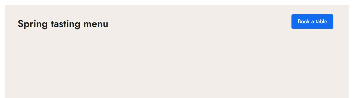
Note: The editor wraps every block in extra markup, so a positioned block can sit a few pixels differently on the editing canvas. Use Preview to check the exact spot, and check the phone view: a block placed over other content can cover text on a narrow screen. Phone values in Offset & Width fix that.
Background
Set a background color, a gradient, or both, behind the whole block. A gradient is painted over the color, so a gradient with transparent parts lets the color show through.
For background images, use the Background panel in the Style tab of the Row or Column.