The Marquee Block moves text, logos, icons or any other blocks in an endless line. It runs left, right, up or down, without a gap and without a jump where the line starts again.
Use it for a client logo strip, a big moving headline, an announcement bar, a row of customer cards or a photo strip. See it working on the Marquee demo page.
How to Add a Marquee Block
Step 1: Add the Marquee Block
- Open a page or post in the WordPress Gutenberg editor.
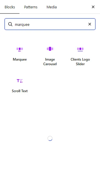
- Click the + button to open the block inserter.
- Search for Marquee under ShapeBlock Pro.
- Insert the block. It starts with five words and moves at once, in the editor as on the site.
Step 2: Change the Items
- Select the block, then click an item in the block. Its settings open right there and the line stands still while you edit.
- Change the text, pick a logo or an icon, and press Done.
- Use Add Text, Add Logos and Add Icon in the block toolbar for more. Add Logos picks several from the Media Library at once.
Step 3: Configure the Marquee Block
Open the settings in the right-hand sidebar. The tabs are:
- Settings: What moves, the items, the motion and the mark between items.
- Layout: Spacing, sizes, alignment and faded edges.
- Style: Colors, borders and typography for the strip, text, logos, icons and item boxes.
- Advanced: Spacing, background and position of the whole block, plus the shared ShapeBlock Pro options.
Settings Tab
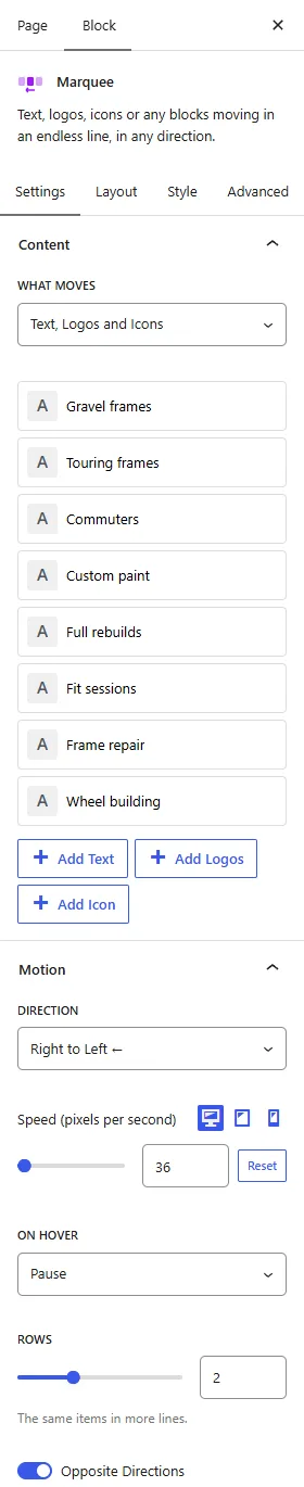
1. Content
- What Moves: Text, Logos and Icons, or Any Blocks.
- Items: Click an item in the list to open it. Each has a Type (Text, Logo or Image, Icon), its text, logo or icon, an icon before the text, its own color and a link. The arrows move it, and you can duplicate or remove it.
- Link: Any item can link somewhere, with Open in New Tab and Add nofollow.
- Any Blocks: Each block inside is one item: a heading, an image, a card, anything. While the block is selected they stand in a row to edit. Click outside it, or use Preview in the toolbar, to see them move.
2. Motion
- Direction: Right to Left, Left to Right, Bottom to Top or Top to Bottom.
- Speed: In pixels per second, per device. A long line and a short line move at the same pace.
- On Hover: Pause, Slow Down or Keep Moving. On touch screens a tap never stops the line.
- Rows: One to four lines of the same items. With up and down they are columns.
- Opposite Directions: Every second line moves the other way.
3. Separator
- Between Items: None, Text or Symbol (such as ✦ or /), or Icon.
Layout Tab
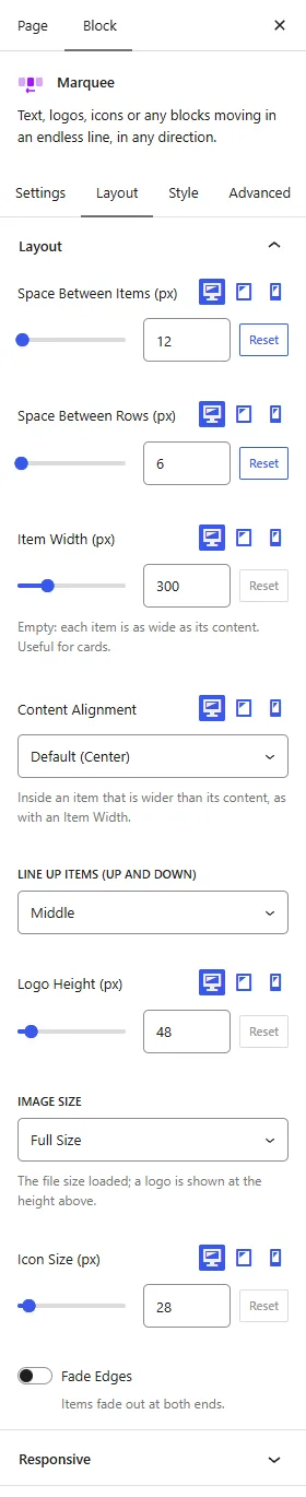
- Space Between Items: Per device.
- Space Between Rows: With more than one line.
- Height: With up and down: how tall the strip is, per device.
- Item Width: Per device. Empty, each item is as wide as its content. Set it for cards.
- Content Alignment: Left, Center or Right inside an item wider than its content. Per device, centered by default.
- Line Up Items: Middle, Top, Bottom or Stretch. Stretch makes cards one height.
- Logo Height, Image Size and Icon Size: How big logos and icons appear, and which image file is loaded.
- Fade Edges and Fade Width: Items fade out at both ends.
Style Tab
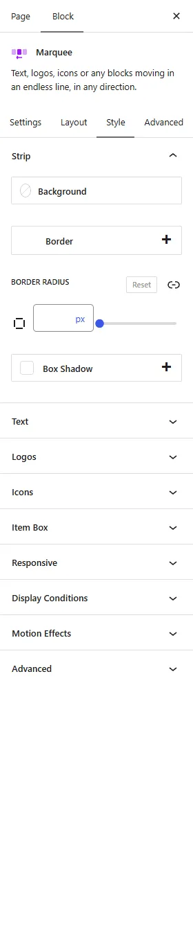
- Strip: Background (color or gradient), border, border radius and box shadow.
- Text: Color, hover color and typography per device. Outline Text draws only the edge of the letters, with its own color and width, and the hover color fills them.
- Logos: Opacity, opacity on hover, and Grayscale, which shows their colors on hover.
- Icons: Color and hover color.
- Item Box: Hover effect (Zoom or Lift), background, border, shadow and hover states, padding and border radius.
- Separator: Color and size.
Tips
- For a line that runs edge to edge, set the Row around it to Full Width content and the block to Full Width.
- For outline text pick a plain font such as Arial. Variable fonts can show lines inside the letters.
- Visitors who turn off animations on their device see the items standing still, and can scroll them by hand.
- Screen readers read the items once, and the keyboard stops at each link once.