The Drop Caps Block is a paragraph that opens with a large first letter, the way a magazine article or a book chapter starts. The letter drops down across two to eight lines of text. It can be a plain letter, a letter in a filled box, a letter in an outlined box, or an outlined letter, and the paragraph can run in up to four newspaper columns.
Use it to open a blog post, a story on an About page, an editor’s letter, a recipe introduction, a long product description or any long-form text that should feel editorial.
How to Add a Drop Caps Block
Follow these steps to add and set up the Drop Caps Block in the Gutenberg editor.
Step 1: Add the Drop Caps Block
- Open a page or post in the WordPress Gutenberg editor.
- Click the + button to open the block inserter.
- Search for Drop Caps under ShapeBlock.
- Insert the block into your page. It starts with a sample paragraph.
- Click into the paragraph on the block and type your own text. The first letter you type becomes the drop cap.

Step 2: Configure the Drop Caps Block
Select the Drop Caps Block and open its settings in the right-hand sidebar. The available tabs are:
- Settings: Choose the style of the letter and how many lines it spans.
- Layout: Run the text in newspaper columns, with a line between them if you like.
- Style: Style the letter (colors, box, font, space) and the paragraph text.
- Advanced: Set the spacing, position and background of the whole block.

Writing the Text
The paragraph is typed right on the block, not in the sidebar. You can use the normal text formatting: bold, italic, links and line breaks (Shift + Enter). The drop cap always uses its own color, font and weight from the Style tab, even when the first word is bold or a link.
Note: The drop cap is always the first letter of the paragraph. If the text starts with a quotation mark, the quotation mark and the letter after it drop together. Start the text with the letter itself if you want only the letter.
Settings Tab

Drop Cap
- Style: Plain Letter (a large letter, nothing around it), Letter in a Box (the letter on a filled box), Letter in an Outline (the letter inside a box with a border) or Outlined Letter (the letter drawn as an outline, with an inside color of your choice).
- Lines Tall: How many lines of text the letter spans, from 2 to 8. The default is 3. Responsive settings are available: reset Tablet or Mobile to use the value of the larger screen, or set a smaller value so the letter does not take too much room on a phone.
Layout Tab

Columns
- Text Columns: Run the paragraph in 1 to 4 newspaper columns. The text flows from the bottom of one column to the top of the next. Responsive settings are available. Phones show one column unless you set a Mobile value.
- Column Gap: The space between the columns, for example 48px. When empty, 40px.
- Line Between Columns: Draws a thin vertical line between the columns.
- Line Color: The color of that line. When empty, a light gray. This option appears when Line Between Columns is on.
Style Tab
The Style tab contains the Drop Cap and Text panels. Some options in the Drop Cap panel change with the style chosen in the Settings tab.

1. Drop Cap
- Letter Color: The color of the letter. For the Outlined Letter style this option is called Outline Color and colors the outline.
- Box Color: The color of the box behind the letter (Letter in a Box). For Letter in an Outline it is called Box Outline Color and colors the border of the box. For Outlined Letter it is called Inside Color and fills the inside of the letter; set it to the background color of your section for a hollow letter.
- Box Radius: Round the corners of the box, for example 6px (the default). This option appears for Letter in a Box and Letter in an Outline.
- Font Family: The font of the letter only, for example Georgia, serif. When empty, the letter uses the font of the paragraph. A serif letter over sans-serif text gives a classic book look.
- Font Weight: The weight of the letter, from 300 (light) to 900 (black). The default is 700.
- Space to the Text: The space between the letter and the text beside it, for example 0.15em or 12px. When empty, 0.1em for a plain or outlined letter and a little more for a letter in a box.
2. Text
- Color: The color of the paragraph text.
- Typography: Customize the font family, size, weight, style, text transform, line height and letter spacing of the paragraph. Responsive settings are available for desktop, tablet and mobile.
Note: The drop cap is sized from the paragraph’s font size and line height. Set the line height as a plain number (for example 1.7) so the letter lines up exactly with the lines of text it spans.
Advanced Tab
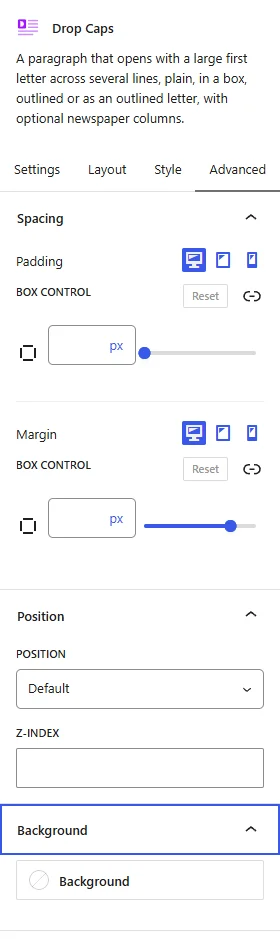
The Advanced tab has the same panels as on every ShapeBlock block: Spacing (padding and margin per device), Position (place the block with offsets, width and z-index) and Background (a color or gradient behind the whole block). They are explained in Advanced Tab: Spacing, Position and Background.
Tips
- Use one drop cap per article, at the start, and maybe one more after a section break. More than that and none of them stand out.
- Three or four lines suit most body text. Save six to eight lines for a large opening paragraph or a hero.
- Set Lines Tall to 3 on Mobile when you use more lines on desktop, so the letter does not push the text into a thin strip on a phone.
- On a dark section, pick Outlined Letter with a light Outline Color and the section’s background as the Inside Color.
- Newspaper columns read best with three or more lines of text in each column. Give long text 2 or 3 columns on desktop and leave phones at one.
Live demo: see the Drop Caps Block in action on the Drop Caps demo page.