The Advanced Data Table Block shows data in a table that visitors can search, sort, and page through. You can type the data in the editor or import it from a CSV file exported from Excel or Google Sheets. Visitors can also copy the rows or download them as Excel, CSV, or PDF.
Use it for price lists, schedules, specifications, comparison tables, and any long list of data.
How to Add an Advanced Data Table Block
Follow these steps to add and configure the Advanced Data Table Block in the Gutenberg editor.
Step 1: Add the Advanced Data Table Block
- Open a page or post in the WordPress Gutenberg editor.
- Click the + button to open the block inserter.
- Search for Data Table under ShapeBlock.
- Insert the Advanced Data Table Block into your page.
- Select the block to access its settings in the right-hand sidebar.
- Enter the Column count and Row count and click Create Table, or click Or import a CSV file.

Step 2: Configure the Advanced Data Table Block
Select the Advanced Data Table Block and open its settings in the right-hand sidebar. The available tabs are:
- Settings: Set the header row, search, sorting, pages, and export buttons, or import a CSV file.
- Layout: Choose a table layout, row effects, and how the table looks on phones.
- Style: Customize the table box, cells, header, body, footer, buttons, and single cells.
- Advanced: Configure the block padding, margin, and background.
Click a cell to type in it, or click its + to add any block. To add or remove rows and columns, click a cell and use Edit table in the block toolbar: Insert row before, Insert row after, Delete row, Insert column before, Insert column after, and Delete column.
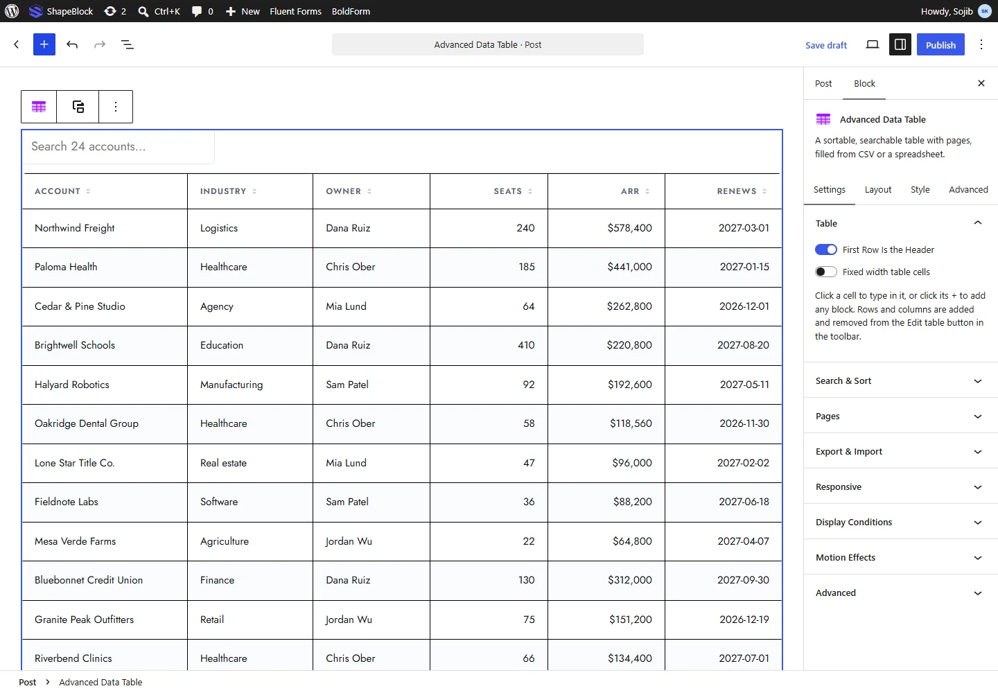
Settings Tab
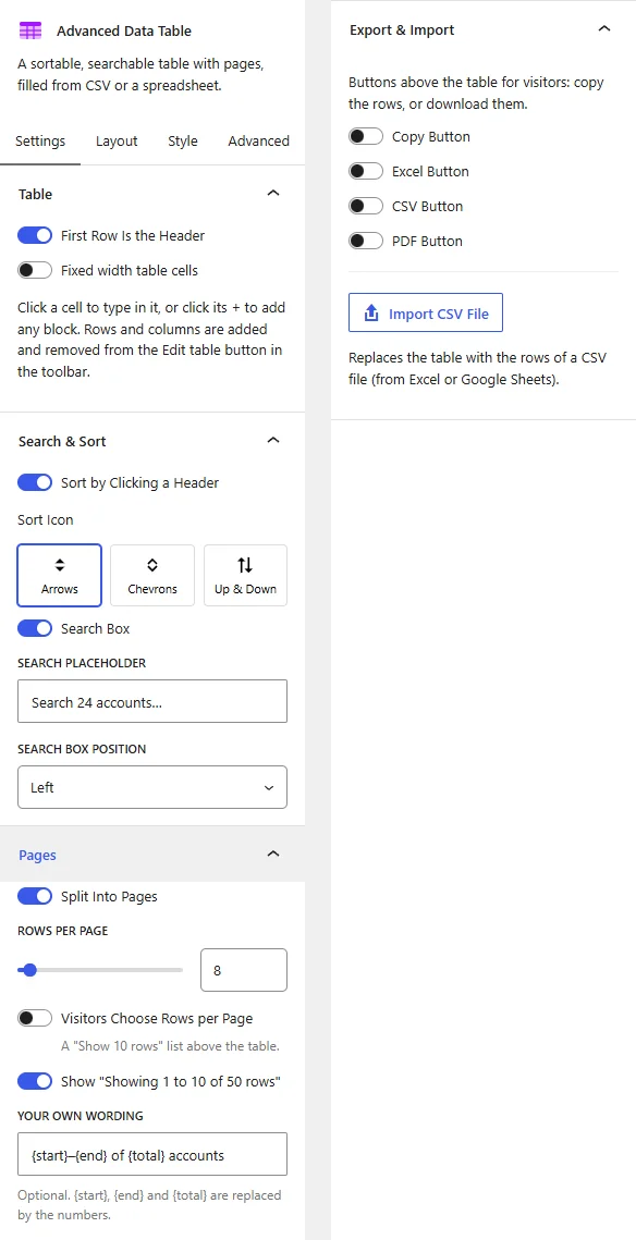
The Settings tab contains the Table, Search & Sort, Pages, and Export & Import panels.
1. Table
- First Row Is the Header: Use the first row as the table header. Sorting and the header style options need a header row.
- Fixed width table cells: Give every column the same width instead of sizing columns to their content.
2. Search & Sort
- Sort by Clicking a Header: Let visitors sort the rows by clicking a column header. This option appears when the table has a header row.
- Sort Icon: Choose the icon shown in the header: Arrows, Chevrons, or Up & Down.
- Search Box: Show a search box above the table. Rows that do not match are hidden as visitors type.
- Search Placeholder: Enter the text shown in the empty search box.
- Search Box Position: Place the search box on the Right, Center, or Left.
3. Pages
- Split Into Pages: Show the rows a page at a time, with page buttons under the table.
- Rows per Page: Set how many rows each page shows.
- Visitors Choose Rows per Page: Show a “Show 10 rows” list above the table.
- Choices: Enter the numbers in that list, separated by commas.
- Show “Showing 1 to 10 of 50 rows”: Show a line under the table with the rows on view and the total.
- Your Own Wording: Optional. Write your own text for that line.
{start},{end}, and{total}are replaced by the numbers.
4. Export & Import
These buttons appear above the table for visitors.
- Copy Button: Copy the rows to the clipboard.
- Excel Button: Download the rows as an Excel file.
- CSV Button: Download the rows as a CSV file.
- PDF Button: Open the print window, where the table can be saved as a PDF.
- File Name: Enter the name of the downloaded file. This option appears when any export button is on.
- Import CSV File: Replace the table with the rows of a CSV file from the Media Library or your computer.
Note: Importing a CSV file replaces the whole table, including any text you typed.
Layout Tab
The Layout tab contains the Layout, Rows, Header, and Phones panels.
1. Layout
- Layout: Click a ready-made look for the table: Default, Bordered, Minimal, Card Rows, Dark, or Comparison. You can change any of it in the Style tab.
2. Rows
- Striped Rows: Give every other row a different background. Set the Stripe Color and Stripe Text Color.
- Highlight Row on Hover: Change a row color when the pointer is over it. Set the Hover Background and Hover Text Color.
3. Header
This panel appears when the table has a header row.
- Sticky Header: Keep the header in view while the table scrolls inside its box.
- Table Height (px): Set the height of the scrolling box. When empty, the table uses most of the screen.
4. Phones
- On Phones: Choose Scroll Sideways to keep the table as it is with a sideways scroll, or Stack Each Row as a Card to show each row as a card.
Style Tab
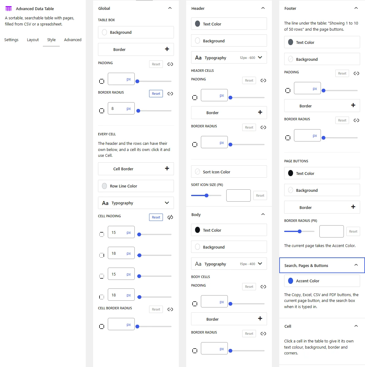
The Style tab contains the Global, Header, Body, Footer, Search, Pages & Buttons, and Cell panels. Some panels only appear when the matching feature is on.
1. Global
- Table Box: Set the Background, Border, Padding, and Border Radius of the box around the table.
- Every Cell: Set the Cell Border, Typography, Cell Padding, and Cell Border Radius for all cells. The header and body can override these below.
2. Header
- Text Color, Background, Typography: Style the header row.
- Header Cells: Set the Padding, Border, and Border Radius of the header cells.
- Sort Icon Color and Sort Icon Size (px): Style the sort icon. These options appear when sorting is on.
3. Body
- Text Color, Background, Typography: Style the body rows.
- Body Cells: Set the Padding, Border, and Border Radius of the body cells.
4. Footer
The line under the table with “Showing 1 to 10 of 50 rows” and the page buttons.
- Text Color, Background, Padding, Border, Border Radius: Style the footer area.
- Page Buttons: Set the Text Color, Background, Border, and Border Radius (px) of the page buttons. The current page uses the Accent Color.
5. Search, Pages & Buttons
- Accent Color: Set the color of the Copy, Excel, CSV, and PDF buttons, the current page button, and the search box while visitors type in it.
- Rows per Page List: Set the Label Color, Text Color, Background, Border, Border Radius (px), Width (px), and Height (px) of the rows per page list.
6. Cell
- Cell: Click a cell in the table to give that cell its own Text Color, Background, Border, and Border Radius. Use it to highlight a price, a total, or a recommended plan.
Advanced Tab
The Advanced tab provides additional spacing and background controls for the Advanced Data Table Block. These settings apply to the entire block.
1. Spacing
- Padding: Set the inner spacing around the entire Advanced Data Table Block. Configure the top, right, bottom, and left values separately.
- Margin: Set the outer spacing around the entire Advanced Data Table Block. Configure the top, right, bottom, and left values separately.
Both controls support responsive settings for desktop, tablet, and mobile devices.
2. Background
- Background: Customize the background of the entire Advanced Data Table Block using a background color or gradient.
Note: The background applies to the whole block area.
Live demo: see the Advanced Data Table Block in action on the Advanced Data Table demo page.