The Advanced Accordion Block shows content in sections that open and close. Each section has a title and can hold any blocks: text, images, buttons, columns, or even another accordion.
Use it for FAQs, course outlines, product details, and any long content you want to keep compact.
How to Add an Advanced Accordion Block
Follow these steps to add and configure the Advanced Accordion Block in the Gutenberg editor.
Step 1: Add the Advanced Accordion Block
- Open a page or post in the WordPress Gutenberg editor.
- Click the + button to open the block inserter.
- Search for Advanced Accordion under ShapeBlock.
- Insert the Advanced Accordion Block into your page.
- Select the block to access its settings in the right-hand sidebar.
- Type each section title on the block, and add blocks inside the section. Use the + under the last section to add a new one.
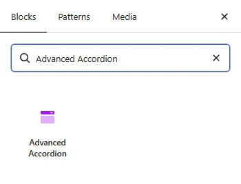
Step 2: Configure the Advanced Accordion Block
Select the Advanced Accordion Block and open its settings in the right-hand sidebar. The available tabs are:
- Settings: Choose how sections open, the title tag, and the open and close icons.
- Layout: Set the space between sections and the icon position.
- Style: Customize the sections, titles, content, and icons.
- Advanced: Configure the block padding, margin, and background.
Each section is an Accordion Section block with its own settings. Select a section to see them (see Section Settings below).

Settings Tab
The Settings tab contains the Accordion panel.
1. Accordion
- Open Sections: Choose One at a time to close the open section when another one opens, or Several at once to let visitors open more than one.
- Title Tag: Choose the HTML tag for the section titles: H2 to H6, P, or DIV.
- Icon When Closed: Choose the icon shown on a closed section.
- Icon When Open: Choose the icon shown on an open section.
Note: With no icon, a chevron turns over. With one icon, it turns over. With both icons, they swap.
2. Section Settings
Select a single section (the Accordion Section block) to see its own Section panel.
- Open when the page loads: Show this section open when the page loads.
- Icon Before the Title: Choose an icon shown before this section title.
- Icon Style: Choose the shape around the icon: Plain, Circle, Circle Outline, Square, or Square Outline.
- Icon Colour, Icon Size, Box Size, Box Background: Customize the icon and the box around it. These options appear when an icon is chosen.
- Border Colour: Set the outline color. This option appears with the Circle Outline and Square Outline styles.
- Corner Radius: Round the corners of the icon box.

Layout Tab
The Layout tab contains the Layout panel.
1. Layout
- Space Between: Set the space between sections. Responsive settings are available.
- Icon Position: Show the open and close icon on the Right or Left of the title.
Style Tab
The Style tab contains the Sections, Title, Content, and Open / Close Icon panels. Controls marked “(open)” apply to a section while it is open.
1. Sections
- Background: Set the section background color or gradient.
- Background (open): Set the background of an open section.
- Border: Set the section border width, style, and color.
- Border Colour (open): Set the border color of an open section.
- Corner Radius: Round the section corners.
- Shadow: Add a shadow around each section.
2. Title
- Typography: Customize the font family, size, weight, style, text transform, line height, and letter spacing. Responsive settings are available for desktop, tablet, and mobile devices.
- Colour: Set the title color.
- Colour (open): Set the title color of an open section.
- Background: Set the title background color or gradient.
- Background (open): Set the title background of an open section.
- Padding: Set the space inside the title area. Responsive settings are available.
- Margin: Set the space outside the title area. Responsive settings are available.
3. Content
- Text Colour: Set the color of the text inside the sections.
- Background: Set the background color or gradient of the content area.
- Padding: Set the space around the content. Responsive settings are available.
4. Open / Close Icon
- Colour: Set the icon color.
- Colour (open): Set the icon color of an open section.
- Size: Set the icon size. Responsive settings are available.

Advanced Tab
The Advanced tab provides additional spacing and background controls for the Advanced Accordion Block. These settings apply to the entire block.
1. Spacing
- Padding: Set the inner spacing around the entire Advanced Accordion Block. Configure the top, right, bottom, and left values separately.
- Margin: Set the outer spacing around the entire Advanced Accordion Block. Configure the top, right, bottom, and left values separately.
Both controls support responsive settings for desktop, tablet, and mobile devices.
2. Background
- Background: Customize the background of the entire Advanced Accordion Block using a background color or gradient.
Note: The background applies to the whole block area.
Live demo: see the Advanced Accordion Block in action on the Advanced Accordion demo page.