The Rotating Text Block shows text that turns around in a circle, with an icon in the middle. The circle can also link to another page.
It works well as a badge next to a heading or a “scroll down” or “contact us” button in a hero section.
How to Add a Rotating Text Block
Follow these steps to add and configure the Rotating Text Block in the Gutenberg editor.
Step 1: Add the Rotating Text Block
- Open a page or post in the WordPress Gutenberg editor.
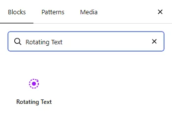
- Click the + button to open the block inserter.
- Search for Rotating Text under ShapeBlock.
- Insert the Rotating Text Block into your page.
- Select the block to access its settings in the right-hand sidebar.
Step 2: Configure the Rotating Text Block
Select the Rotating Text Block and open its settings in the right-hand sidebar. The available tabs are:
- Settings: Enter the circle text, choose the middle icon, add a link, and set the rotation.
- Style: Customize the circle, text, and icon.
- Advanced: Configure the block padding, margin, and background.

Settings Tab
The Settings tab contains the Content and Animation panels.
1. Content
- Text: Enter the text that goes around the circle. It is spread evenly around the whole circle: a short text is repeated, and a long text is made smaller. A separator such as • between words looks good.
- Icon in the Middle: Choose the icon shown in the center of the circle.
- Link: Enter a URL to make the circle clickable.
- Open in a New Tab: Open the link in a new browser tab. This option appears when a link is entered.
- Position: Place the circle on the Left, Center, or Right.
2. Animation
- Time for One Turn (s): Set how many seconds the text takes to go around once. A higher number turns more slowly.
- Direction: Choose Clockwise or Anticlockwise.
- Stop While the Mouse Is Over It: Choose Yes to pause the rotation while a visitor points at the circle.
Note: Each Animation setting starts on Default, which uses the value set for the whole site under ShapeBlock > Animation. The current site value is shown in the control. Change a setting here to use a different value for this block only.

Style Tab
The Style tab contains the Circle, Text, and Icon panels.
1. Circle
- Size: Set the width of the circle. When empty, the circle is 160px. Responsive settings are available.
- Background: Set a background color or gradient for the circle.
2. Text
- Colour: Set the color of the rotating text.
- Typography: Customize the font family, size, weight, style, text transform, line height, and letter spacing. Responsive settings are available.
3. Icon
- Middle Background: Set a background color or gradient for the center area behind the icon.
- Colour: Set the icon color.
- Size: Set the icon size. Responsive settings are available.

Advanced Tab
The Advanced tab provides additional spacing and background controls for the Rotating Text Block. These settings apply to the entire block.
1. Spacing
- Padding: Set the inner spacing around the entire Rotating Text Block. Configure the top, right, bottom, and left values separately.
- Margin: Set the outer spacing around the entire Rotating Text Block. Configure the top, right, bottom, and left values separately.
Both controls support responsive settings for desktop, tablet, and mobile devices.
2. Background
- Background: Customize the background of the entire Rotating Text Block using a background color or gradient.
Note: The background applies to the whole block area.
Live demo: see the Rotating Text Block in action on the Rotating Text demo page.