The Flip Box Block shows a box with a front and a back. When a visitor points at the box, or taps it on a touch screen, it turns over, slides, pushes, zooms, or fades to show the back. Each side can be typed on the box or built from a template.
Use it for services, team members, features, and pricing teasers where the back side gives more detail and a button.
How to Add a Flip Box Block
Follow these steps to add and configure the Flip Box Block in the Gutenberg editor.
Step 1: Add the Flip Box Block
- Open a page or post in the WordPress Gutenberg editor.
- Click the + button to open the block inserter.
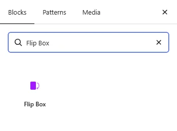
- Search for Flip Box under ShapeBlock.
- Insert the Flip Box Block into your page.
- Select the block to access its settings in the right-hand sidebar.
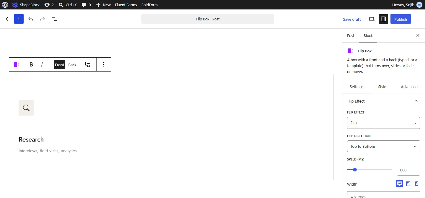
- Type the title and text of the front side on the box. Click Back in the block toolbar to type the back side and its button.
Step 2: Configure the Flip Box Block
Select the Flip Box Block and open its settings in the right-hand sidebar. The available tabs are:
- Settings: Set the flip effect, box size, and the content of the front and back.
- Style: Customize the box, each side, and the button.
- Advanced: Configure the block padding, margin, and background.
In the editor, the box turns when you point at it while it is not selected. While it is selected, use Front and Back in the block toolbar to switch sides.
Settings Tab
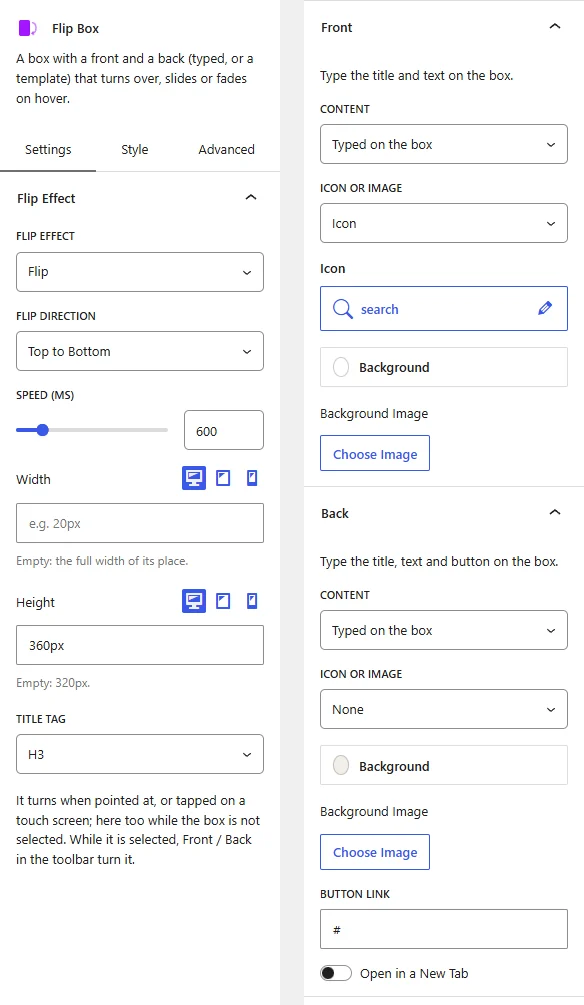
The Settings tab contains the Flip Effect, Front, and Back panels.
1. Flip Effect
- Flip Effect: Choose how the back side appears: Flip, Slide, Push, Zoom In, Zoom Out, or Fade.
- Flip Direction: Choose Left to Right, Right to Left, Top to Bottom, or Bottom to Top. This option appears with the Flip, Slide, and Push effects.
- Speed (ms): Set how long the change takes.
- Width: Set the box width. When empty, the box takes the full width of its place. Responsive settings are available.
- Height: Set the box height. When empty, the box is 320px. Responsive settings are available.
- Title Tag: Choose the HTML tag for the titles on both sides.
2. Front
- Content: Choose Typed on the box to type a title and text, or A template to show a template built from any blocks under ShapeBlock > Templates.
- Template: Choose the template to show. A tall template needs a taller box, so increase Height in the Flip Effect panel. This option appears with A template.
- Icon or Image: Show None, an Icon, or an Image above the title, then choose the icon or image.
- Background: Set the side background color or gradient.
- Background Image: Choose an image for the side background.
- Colour Over the Image (%): Set how strongly the background color covers the image, so text stays readable. This option appears when a background image is set.
3. Back
The Back panel has the same options as the Front panel, plus a button.
- Button Link: Enter the URL for the button on the back side.
- Open in a New Tab: Open the button link in a new browser tab. This option appears when a link is entered.
Style Tab
The Style tab contains the Box, Front, Back, and Button panels.
1. Box
- Corner Radius: Round the box corners.
- Border: Set the box border width, style, and color.
- Shadow: Add a shadow around the box.
2. Front and Back
Each side has its own panel with these options. Options for typed content are hidden when the side uses a template.
- Alignment: Align the content Center, Left, or Right.
- Padding: Set the space inside the side. Responsive settings are available.
- Icon Colour, Icon Background, Icon Size: Style the icon. These options appear when the side shows an icon.
- Icon Box Width and Icon Box Height: Set the size of the box around the icon. When empty, the box is twice the icon size.
- Icon Border and Icon Border Radius: Add a border around the icon box and round its corners.
- Image Width: Set the image width. This option appears when the side shows an image.
- Icon Margin or Image Margin: Set the space around the icon or image.
- Title Colour, Title Typography, Title Margin: Style the title.
- Text Colour, Text Typography, Description Margin: Style the text under the title.
3. Button
This panel appears when the back side is typed on the box.
- Text Colour and Background: Set the button colors.
- Text Colour (hover) and Background (hover): Set the button colors when pointed at.
- Typography: Customize the font family, size, weight, style, text transform, line height, and letter spacing. Responsive settings are available for desktop, tablet, and mobile devices.
- Padding: Set the space inside the button.
- Corner Radius: Round the button corners.
- Margin: Set the space around the button. Responsive settings are available.

Advanced Tab
The Advanced tab provides additional spacing and background controls for the Flip Box Block. These settings apply to the entire block.
1. Spacing
- Padding: Set the inner spacing around the entire Flip Box Block. Configure the top, right, bottom, and left values separately.
- Margin: Set the outer spacing around the entire Flip Box Block. Configure the top, right, bottom, and left values separately.
Both controls support responsive settings for desktop, tablet, and mobile devices.
2. Background
- Background: Customize the background of the entire Flip Box Block using a background color or gradient.
Note: The background applies to the whole block area.
Live demo: see the Flip Box Block in action on the Flip Box demo page.